Vision reporting for schools
- 2 Minutes to read
- Print
- DarkLight
- PDF
Vision reporting for schools
- 2 Minutes to read
- Print
- DarkLight
- PDF
Article summary
Did you find this summary helpful?
Thank you for your feedback!
The data in Vision allows you to analyse the quality of teaching and learning at the school.
Explanation of the Vision report
This report shows the quality of teaching and learning across the school. It presents data from teaching evaluation activities to instantly answer questions leaders may have.
At the top left you will see the average rating for all teachers in the report. The small number beside it shows you the number of teachers that are being counted. The adjacent box shows the trend of this data over time.
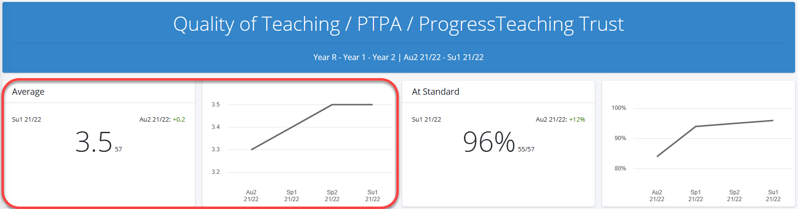
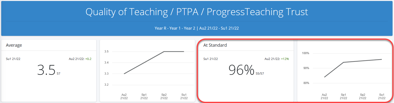
At the top right you will see the percentage of teachers that are performing at the expected standard for your school. The small number beside it shows you the number of teachers that are at this level out of the total. The adjacent box shows the trend of this data over time.
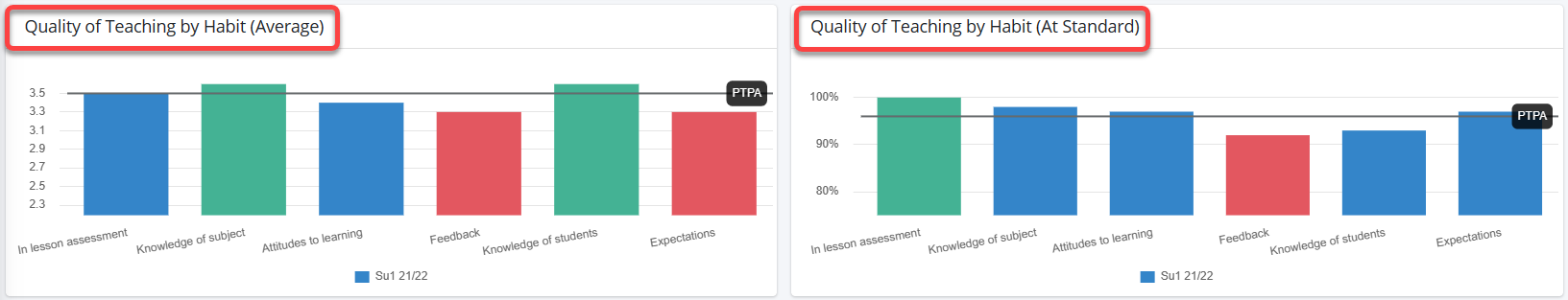
Below you will see a series of bar graphs that display the data by Habit (i.e. the observation strands that you evaluate), Year Group, Subject, and Teacher Type.
On the left you will see an average of the data, whereas on the right you will see the percentage of that data that is at the expected standard for your school.
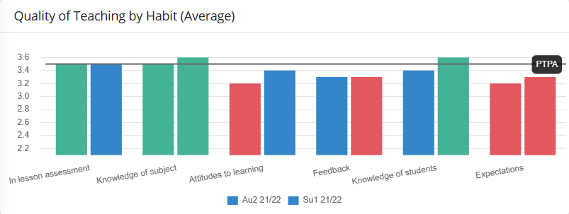
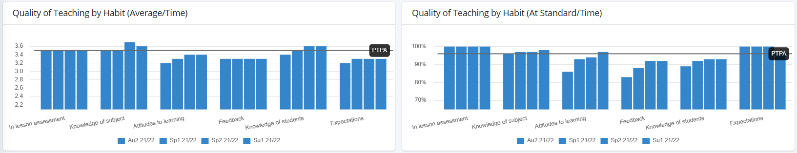
If you selected a start term and an end term, then there will be two bars for each Habit / Year Group / Subject / Teacher Type. One for the start term, and one for the end term.
If you only selected an end term, then there will be one bar for each Habit / Year Group / Subject / Teacher Type.
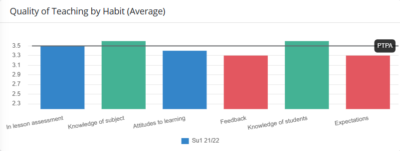
The colours of the bars are as follows:
| Colour | Description |
|---|---|
| Green | The highest performing Habit / Year Group / Subject / Teacher Type for the term. |
| Blue | In between the highest and lowest performing The highest performing Habit / Year Group / Subject / Teacher Type for the term. |
| Red | The lowest performing Habit / Year Group / Subject / Teacher Type for the term. |
Below these tables you will see bar graphs showing the quality of teaching by Habit over time for each term between your start and end terms.
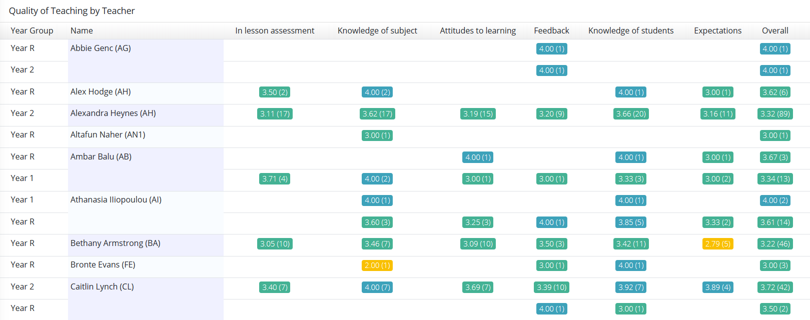
Finally, at the bottom of the report you will see a summary of the individual teacher data contributing to the report. Teachers will have a numerical weighted average for each observation strand, and the number in brackets next to it shows the number of observations contributing to it. There is also an overall average at the end of the table.
Was this article helpful?