- 10 Minutes to read
- Print
- DarkLight
- PDF
Trust Feedback Overview
- 10 Minutes to read
- Print
- DarkLight
- PDF
Using the Trust Feedback Overview dashboard, trust leaders can immediately answer questions like:
- What is the overall quality of teaching in my trust?
- Has teaching improved?
- What is the quality of teaching in a year group or subject?
- In which Habits are we stronger and weaker?
- Which teachers need support?
- Which teachers can be my champions?
This dashboard refers to teachers 'At Standard'. A teacher is 'At Standard' if the average feedback ratings they received over the period are within 10% of, or above, the standard threshold.
We make this calculation using our weighted average methodology, which takes account of all feedback in the period but places a higher emphasis on more recent records. This promotes continuous development and allows you to quickly identify any downward trends before they become an issue.
To access this dashboard, navigate to Dashboards > Trust Feedback Overview
Applying filters to the Trust Feedback Overview dashboard
Below is a key with descriptions of all the features available on your Trust Feedback Overview dashboard.
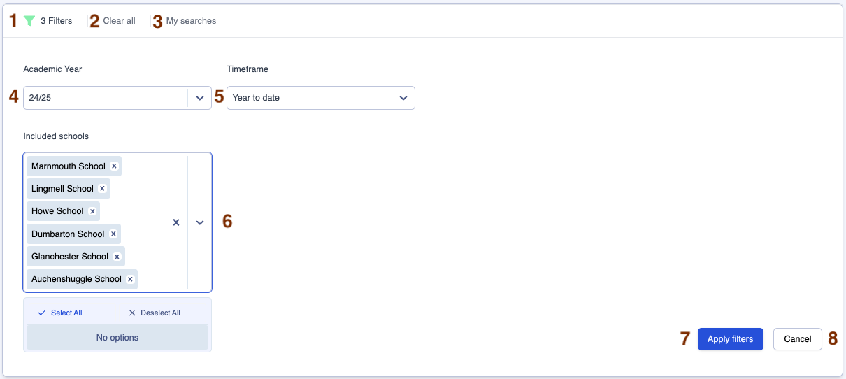
| Area | Feature description |
|---|---|
| 1 | Click on the filter icon to hide or reveal the filters box |
| 2 | Click on 'Clear all' to clear all filters |
| 3 | Click on 'My Searches' to access past searches you have saved (See the 'Using My Searches' section below) |
| 4 | Use the 'Academic Year' filter to switch between academic years (The current academic year is the default year when you navigate to the page) |
| 5 | Use the 'Timeframe' filter to determine the time period for which you wish to view your data (See the 'Selecting different timeframes' section below for a full explanation) |
| 6 | Use the 'Included schools' filter to view data for all schools or selected schools only |
| 7 | Click on 'Apply filters' to apply the filters you have selected |
| 8 | Click on 'Cancel' to hide the filters box |
Using 'My Searches'
The 'My Searches' button allows you to save your favourite filter settings in all dashboards.
Below is a key with descriptions of all the 'My Searches' features.
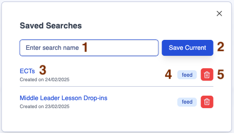
| Area | Feature description |
|---|---|
| 1 | Field to enter your preferred search name |
| 2 | Click on 'Save Current' to save the current set of filters you have applied to the dashboard |
| 3 | Click on the hyperlink to open the dashboard with your preferred filters |
| 4 | This box indicates the dashboard to which this saved search applies |
| 5 | Click on the rubbish bin icon to delete the saved search |
Saving a new search
Step 1
Select the filters you want to apply in the dashboard, for example:
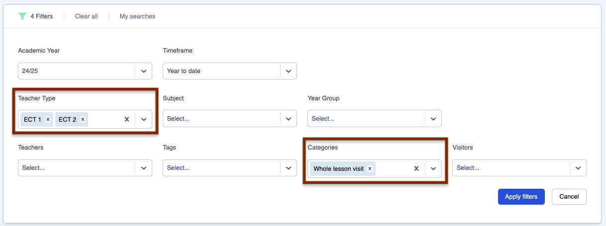
Step 2
Click on the 'My searches' button then enter your preferred search name, for example, 'ECT whole lesson feedback'.
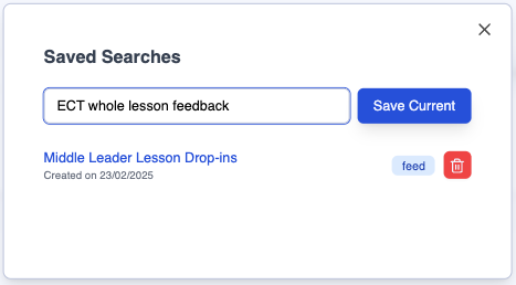
Step 3
Click on 'Save Current' to save your search name along with the selected dashboard filters.
Selecting different timeframes
1. Year to date
The default setting is 'Year to date', so the data you are viewing when you first land on the page is from the first day of this academic year up to today.
2. Half term range
In the 'Timeframe' filter, select 'Half term range', then specify the 'Start Term' and 'End Term' to compare the data between two half terms.

Click on 'Apply filters' (Area 6 in the key above) to apply the filters you have selected.
3. Specific date range
In the 'Timeframe' filter, select 'Date range' then click in the 'Date Range' filter to reveal a calendar. Select a start date and an end date in the calendar. Your selected date range will then be highlighted in navy blue.
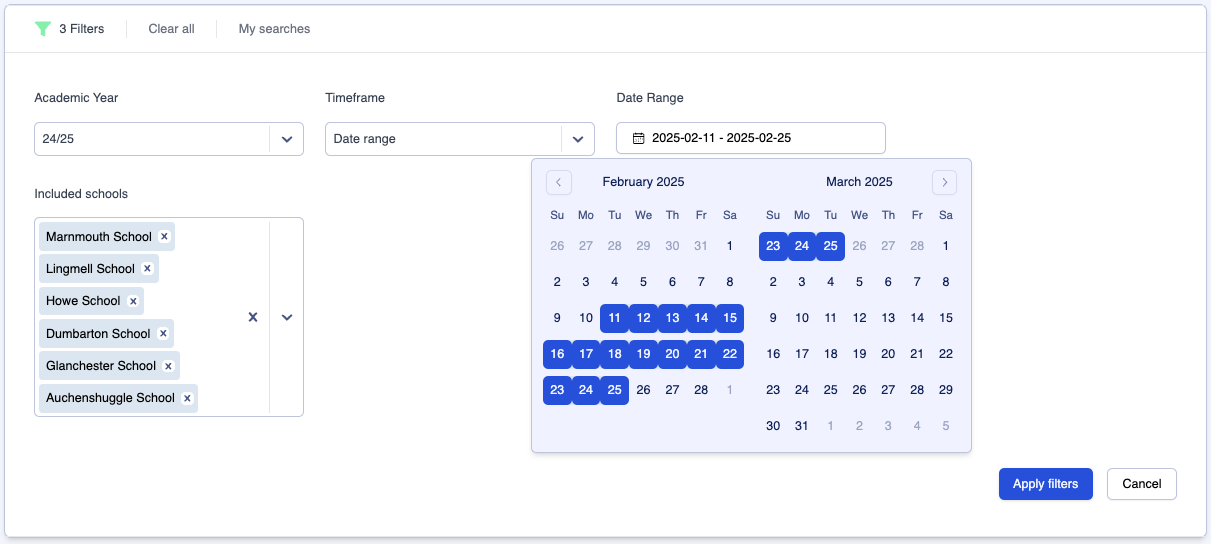
Click on 'Apply filters' to apply the filters you have selected.
Trust Feedback Overview dashboard explanation
The 'Using this dashboard' section of the page is a summary of how your Trust Feedback Overview data is calculated so that leaders have this explanation as a constant point of reference.

Trust Feedback Overview dashboard 'Teachers at Standard'
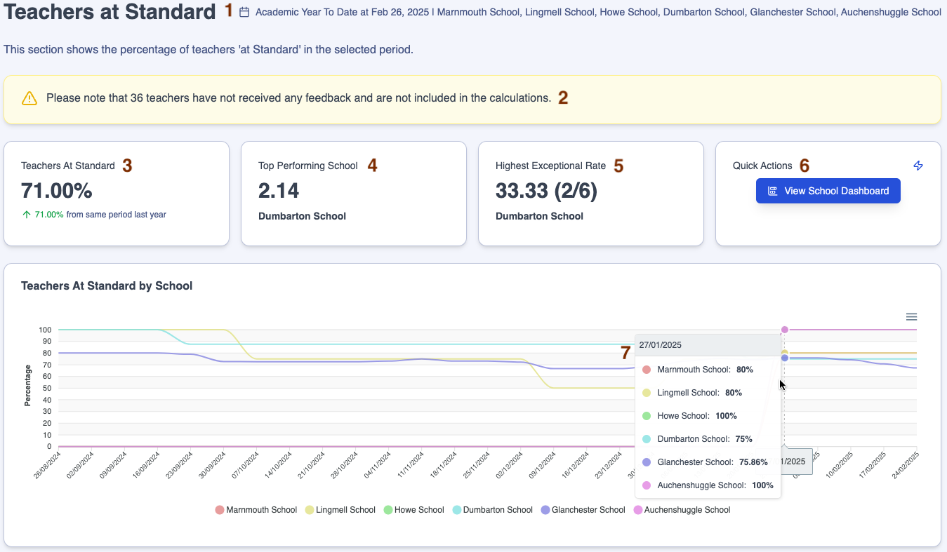
Below is a key with descriptions of all the features available in the 'Teachers at Standard' section of your Trust Feedback Overview dashboard.
| Area | Feature description |
|---|---|
| 1 | The information to the right of the header lists the timeframe and schools for the data you are viewing |
| 2 | The yellow warning box states the number of teachers that have not received any feedback and who therefore have not been included in the calculations |
| 3 | The 'Teachers at Standard' tile displays the percentage of teachers at your trust's expected standard for the selected timeframe as well as a comparison with the same period from last year, where available |
| 4 | The 'Top Performing School' tile displays the school with the highest evaluative rating value. |
| 5 | The 'Highest Exceptional Rate' tile displays the school with the highest percentage of teachers whose typicality falls in the top evaluative rating category |
| 6 | The 'Quick Actions' tile gives you the option to click on the 'View School Dashboard' button to view the equivalent data at school level, if you have the relevant permissions |
| 7 | Hover over the 'Teachers at Standard by School' graph to show the percentage of teachers, school by school, at your trust's expected standard week on week |
Trust Feedback Overview dashboard 'Quality of Teaching by School'
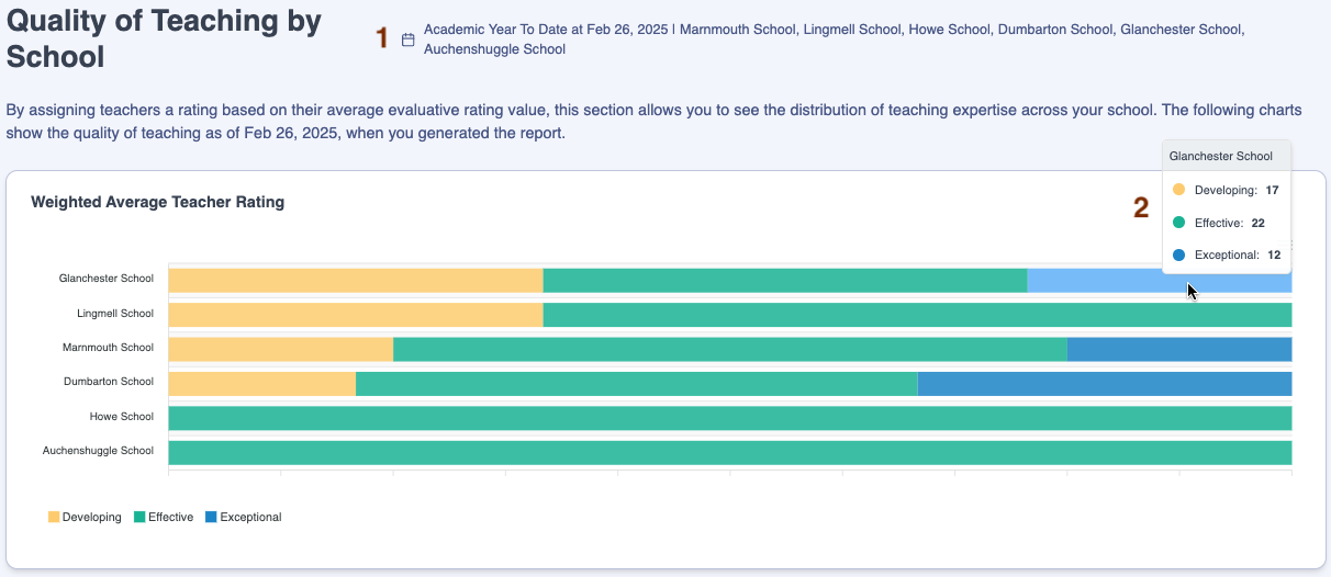
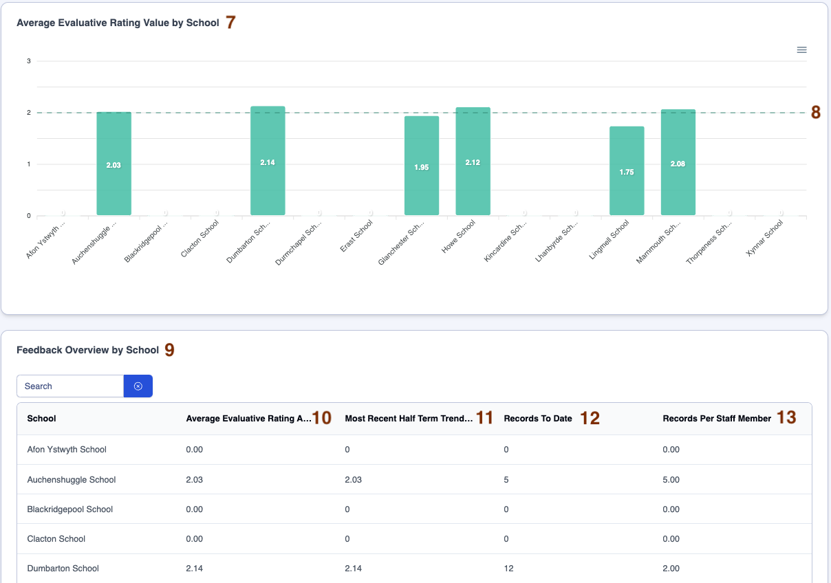
By assigning teachers a rating based on their average evaluative rating value, this section allows you to see the distribution of teaching expertise across the schools in your trust. The following charts show the quality of teaching as of the date when you generated the report.
Below is a key with descriptions of all the features available in the 'Quality of Teaching by School' section of your Trust Feedback Overview dashboard.

| Area | Feature description |
|---|---|
| 1 | The information to the right of the header lists the timeframe and schools for the data you are viewing |
| 2 | Hover over the 'Weighted Average Teacher Rating' graph to show the number of teachers within each quality of teaching category in each school |
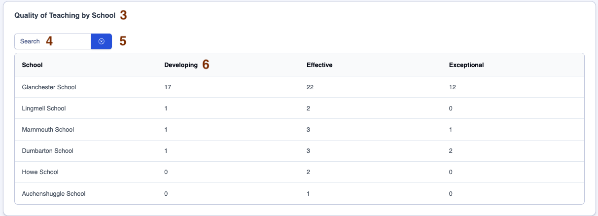
| 3 | The 'Quality of Teaching by School' table displays the number of teachers within each quality of teaching category in each school |
| 4 | Search for the school |
| 5 | Click on the 'x' next to the 'Search' box to clear the contents |
| 6 | Click on any Rating column header to sort the count from lowest to highest, then click again to sort from highest to lowest |
| 7 | The 'Average Evaluative Rating Value by School' graph displays the average evaluative rating for teachers in each school |
| 8 | The dotted line across the graph indicates the average evaluative rating for teachers across the trust |
| 9 | The 'Feedback Overview by School' table displays an overview of evaluative rating headlines for each school |
| 10 | The average evaluative rating across habits for each school |
| 11 | The most recent half-term trend (compared to previous) for each school |
| 12 | The count of feedback records to date for each school |
| 13 | The count of records per teacher for each school |
| 14 | The 'Key Insights' tile provides summary sentences about the data |
Trust Feedback Overview dashboard 'By Teacher Type'
Below is a key with descriptions of all the features available in the 'By Teacher Type' section of your Trust Feedback Overview dashboard.
| Area | Feature description |
|---|---|
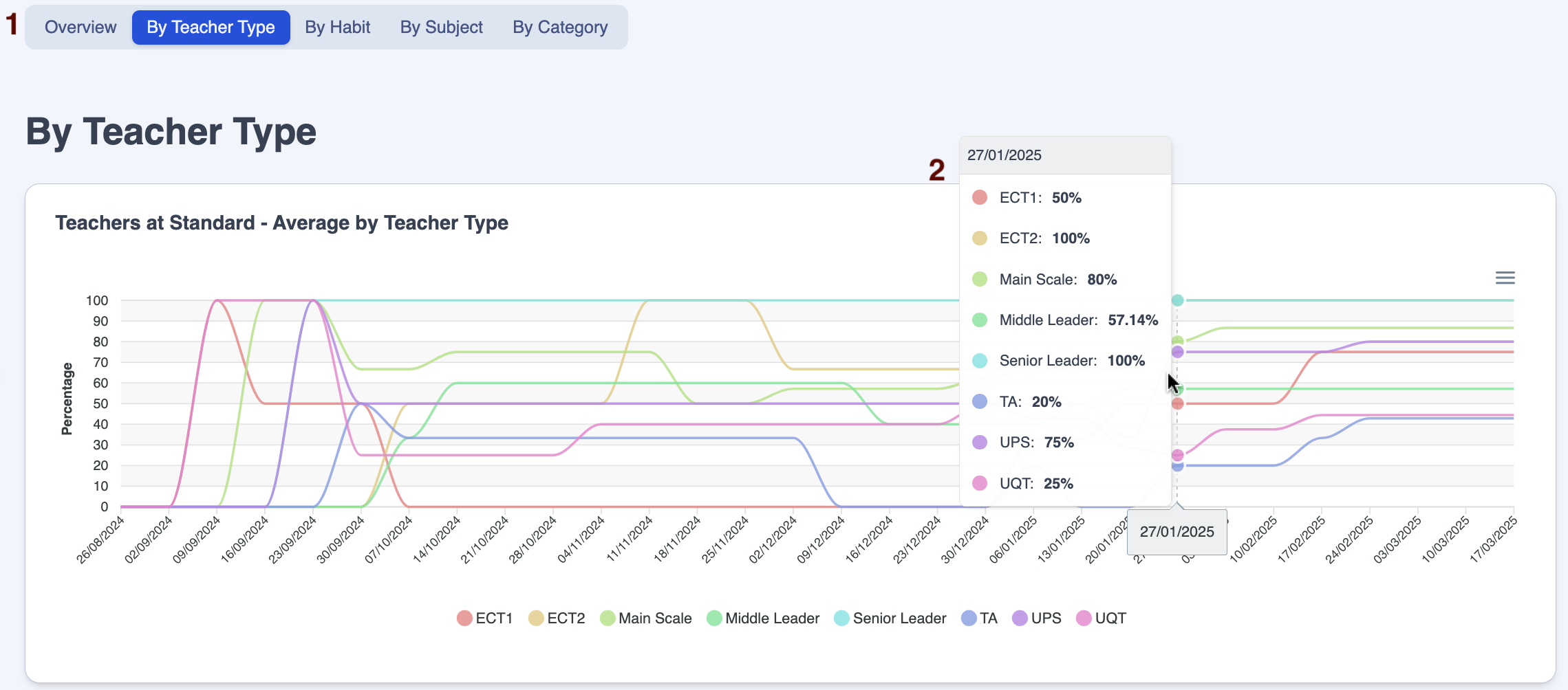
| 1 | 'By Teacher Type' is highlighted, indicating that the headlines in this section relate to the quality of teaching by Teacher Type |
| 2 | The 'Teachers at Standard - Average by Teacher Type' graph displays the percentage of teachers at standard within each Teacher Type. Hover over the line graph to show the percentage of teachers at standard within each Teacher Type week on week |
| Area | Feature description |
|---|---|
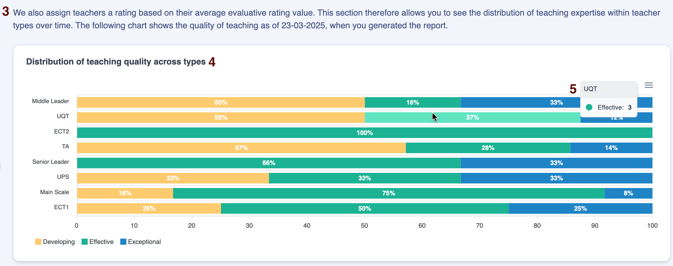
| 3 | Explanation of the 'average evaluative weighting value' |
| 4 | The 'Distribution of teaching quality across types' graph displays, by Teacher Type, the percentage of teachers whose average quality of teaching falls into each of your evaluative rating categories |
| 5 | Hover over any bar in the graph to reveal the count of teachers behind each percentage |
| Area | Feature description |
|---|---|
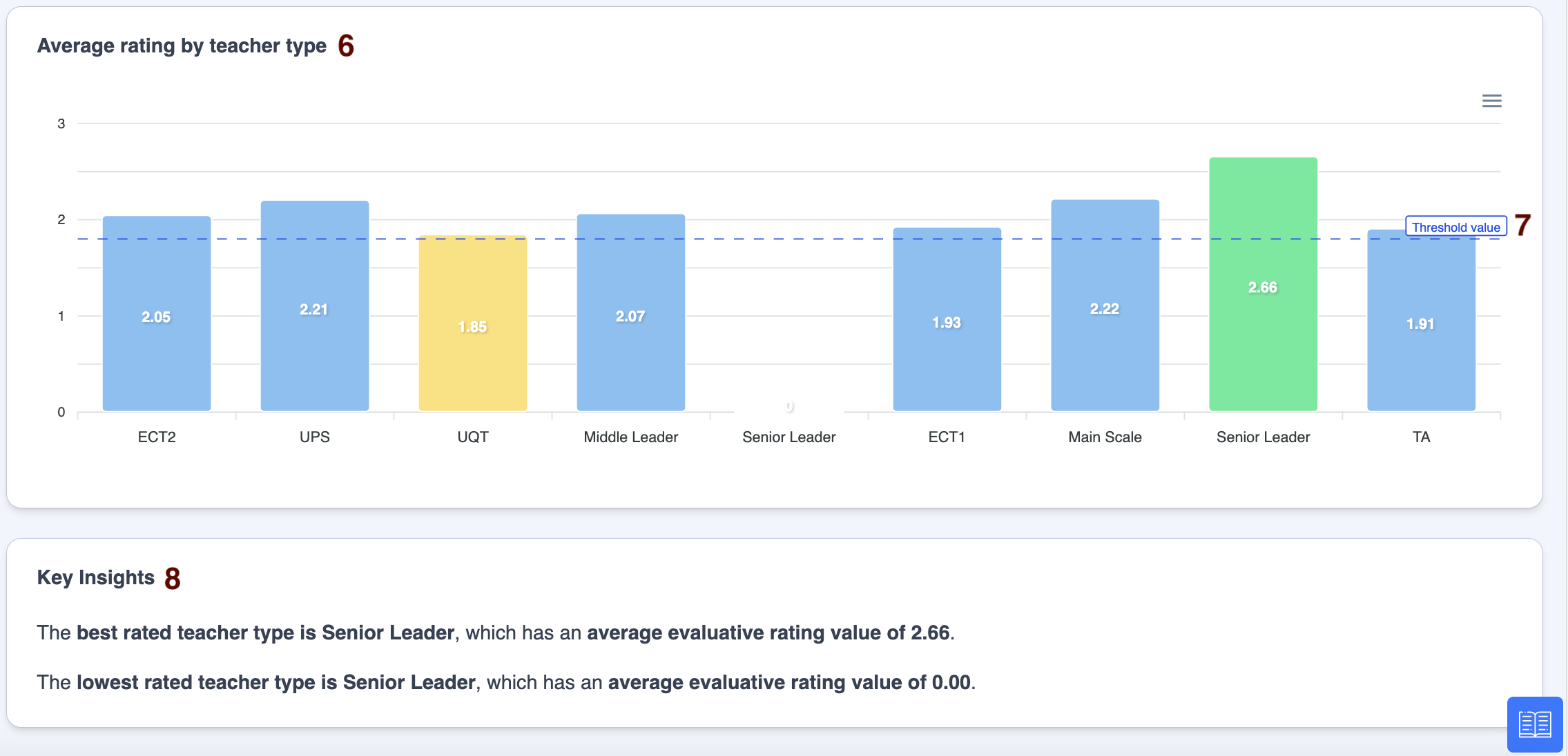
| 6 | The 'Average rating by teacher type' graph displays an average of the evaluative ratings for each of your Teacher Types for the selected timeframe. Green indicates the Teacher Type with the highest rating, amber indicates the Teacher Type with the lowest rating above zero, blue is anything in between |
| 7 | The 'Threshold value' line is the value considered to be 'at standard' |
| 8 | The 'Key Insights' tile provides summary sentences about the data |
Trust Feedback Overview dashboard 'By Habit'
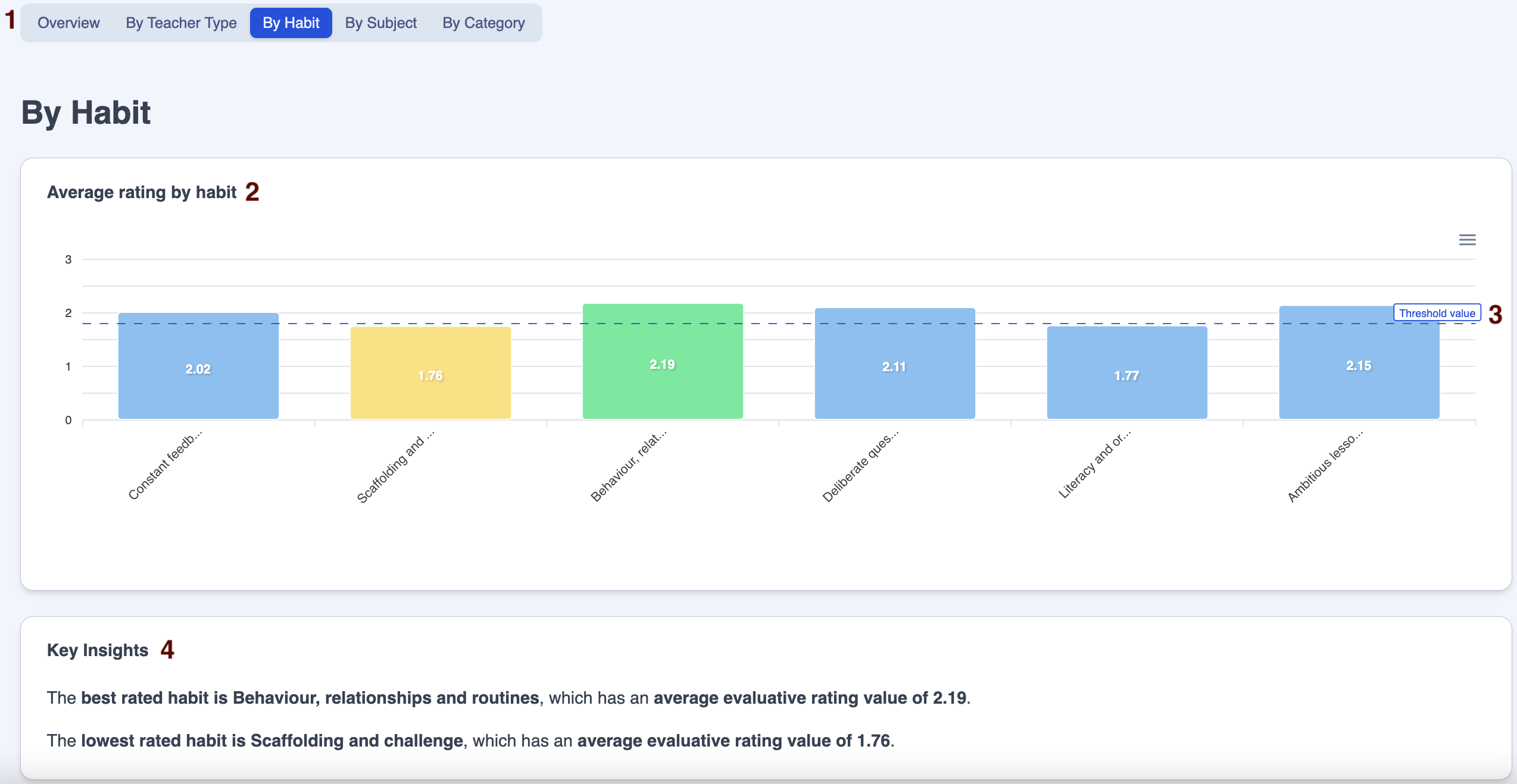
Below is a key with descriptions of all the features available in the 'By Habit' section of your Trust Feedback Overview dashboard.
| Area | Feature description |
|---|---|
| 1 | 'By Habit' is highlighted, indicating that the headlines in this section relate to the quality of teaching by Habit |
| 2 | The 'Average rating by habit' graph displays an average of the evaluative ratings for each of your Habits for the selected timeframe. Green indicates the Habit with the highest rating, amber indicates the Habit with the lowest rating above zero, blue is anything in between |
| 3 | The 'Threshold value' line is the value considered to be 'at standard' |
| 4 | The 'Key Insights' tile provides summary sentences about the data |
Trust Feedback Overview dashboard 'By Subject'
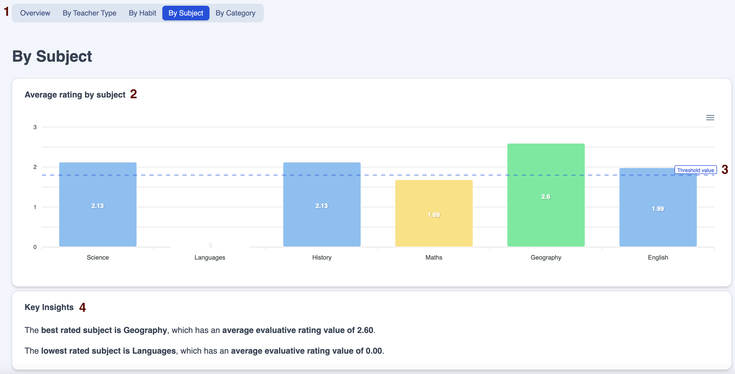
Below is a key with descriptions of all the features available in the 'By Subject' section of your Trust Feedback Overview dashboard.
| Area | Feature description |
|---|---|
| 1 | 'By Subject' is highlighted, indicating that the headlines in this section relate to the quality of teaching by subject |
| 2 | The 'Average rating by subject' graph displays an average of the evaluative ratings for each of your subjects for the selected timeframe. Green indicates the subject with the highest rating, amber indicates the subject with the lowest rating above zero, blue is anything in between |
| 3 | The 'Threshold value' line is the value considered to be 'at standard' |
| 4 | The 'Key Insights' tile provides summary sentences about the data |
Trust Feedback Overview dashboard 'By Category'
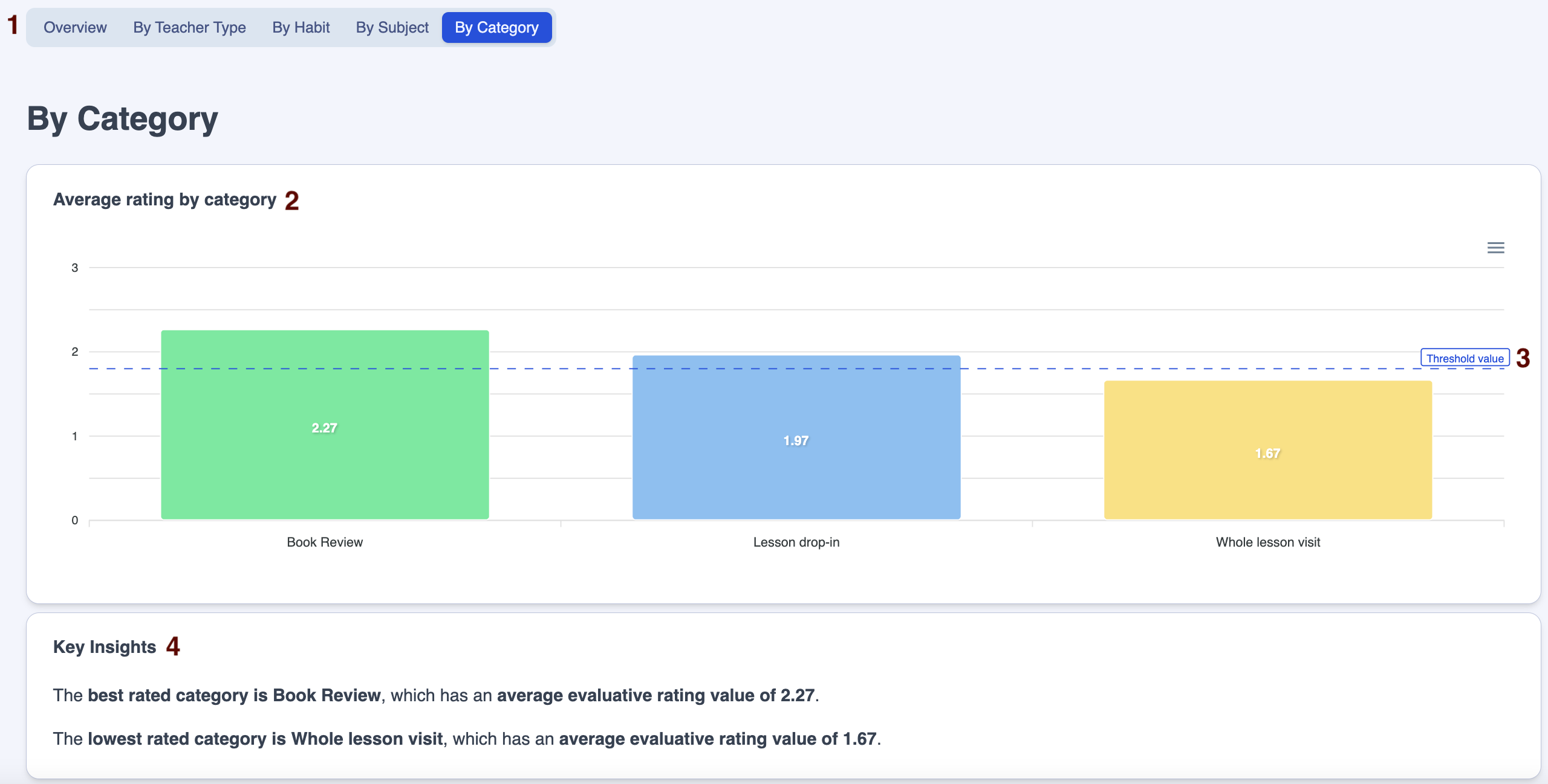
Below is a key with descriptions of all the features available in the 'By Category' section of your Trust Feedback Overview dashboard.
| Area | Feature description |
|---|---|
| 1 | 'By Category' is highlighted, indicating that the headlines in this section relate to the quality of teaching by feedback category |
| 2 | The 'Average rating by category' graph displays an average of the evaluative ratings for each of your feedback categories for the selected timeframe. Green indicates the category with the highest rating, amber indicates the category with the lowest rating above zero, blue is anything in between |
| 3 | The 'Threshold value' line is the value considered to be 'at standard' |
| 4 | The 'Key Insights' tile provides summary sentences about the data |
Exporting data from the Trust Feedback Overview dashboard
There are two ways to export data from your Trust Feedback Overview dashboard.
1. Exporting the whole dashboard
Export the whole Trust Feedback Overview dashboard in PDF format by clicking on the 'Print Report' button.

2. Exporting graphs
Click on the 'Burger' (the three straight lines) next to any graph to export in SVG (image), PNG (image) or CSV (spreadsheet) format.

Questions to use when analysing quality of teaching data on ProgressTeaching with school or trust leaders:
Have all teachers / year groups been seen? Are all leaders dropping into areas with the same regularity? Is there an even spread of drop-ins?
Are all habits being evaluated regularly?
Are leaders achieving a balance between monitoring and evaluation and coaching?
Are leaders’ judgements and evaluations accurate? Do they triangulate with outcomes and behaviour data and feedback from Regional Directors? If not, what needs to happen?
Are comments on habits and action steps high leverage and genuinely developmental? Do they utilise the teaching prompts and avoid poor proxies for learning? Do leaders make time to ensure that feedback moves staff forwards using deliberate practice?
Where are the strengths in terms of provision? Subject areas? Year groups? Habits? How are we cascading and celebrating best practice?
Where are the areas for development in terms of provision? Subject areas? Year groups? Habits? How are leaders using this to inform CPD and coaching? How will we know any follow-up will have impact? What’s the timeframe?
How are we utilising the expertise of teachers averaging as ‘Expert’ overall and in individual Habits?
How are we supporting teachers where the majority of Habits are averaging as ‘Developing’?
How are Heads getting the culture right around drop-ins and evaluation of Habits?
o Where is the celebration? Are ‘shout outs’ taking place?
o Are leaders being coached themselves and are they open and transparent about their own areas for development?


